PR Center
The PR Center conveys the latest information concerning Kiturami to our customers quickly along with happiness.
- Home
- >
- PR Center
About the CI
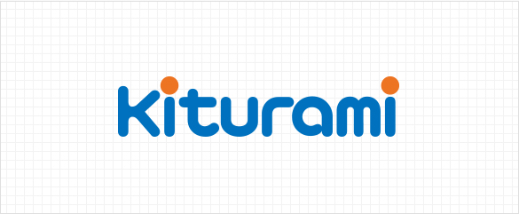
The CI of Kiturami contains the image of a leading boiler company making the leap toward a global heating and air conditioner engineering group.
The basic color of the logo is Blue but with a speck of Orange to represent the essence.
The soft, sensuous logo-type form of Kiturami, which embodies the harmony and friendliness of the company businesses, is an excellent representation of its customer-friendly corporate philosophy.
Color system
Because color is such an important element of Kiturami's identity, using the right color is very necessary. Offprinting is usually the method for expressing color; depending on the medium, however, 4-color printing could be used. When expressing with the 4-color method, other color could be applied to the medium by choosing a color that is the closest approximation of the designated Pantone Color.
Company color
-
Kiturami Blue
- Pantone Color
- P 300 C
- Process Color
- C100+M45
- RGB Color
- R0+G113+B190
-
Kiturami Orange
- Pantone Color
- P 158 C
-
Kiturami Light Gray
- Pantone Color
- P 413 C
- Process Color
- Y5+K20
- RGB Color
- R224+G224+B216
-
Kiturami Dark Gray
- Pantone Color
- P 418 C
- Process Color
- Y30+K80
- RGB Color
- R54+G54+B38
-
Kiturami Gold
- Pantone Color
- P 872 C
-
Kiturami Silver
- Pantone Color
- P 877 C
From being a top specialist in heating and cooling, Kiturami Group has grown to be an integrated energy group


- Kiturami Boiler
- Kiturami Bumyang Air Conditioning
- Shinsung Engineering
- Century
- Kiturami Energy
- Nanokem
- Kiturami Refrigerator
- Kiturami Environment Technology
- Green Energy
- Kiturami Foundation
- Hantan River Country Club
- Hantan River Spa Hotel
- In Seoul 27 Golf Club
- TBC
- Dr. Robbin
- Kiturami Clean Tennis Court
Copyright ⓒ 2019 Kiturami. All Rights Reserved.